
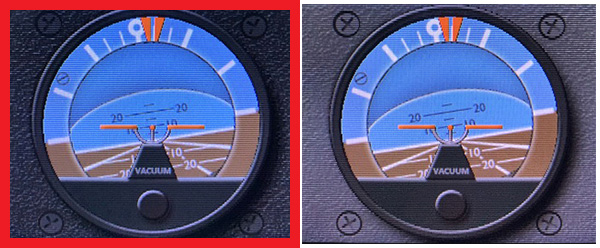
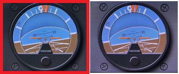
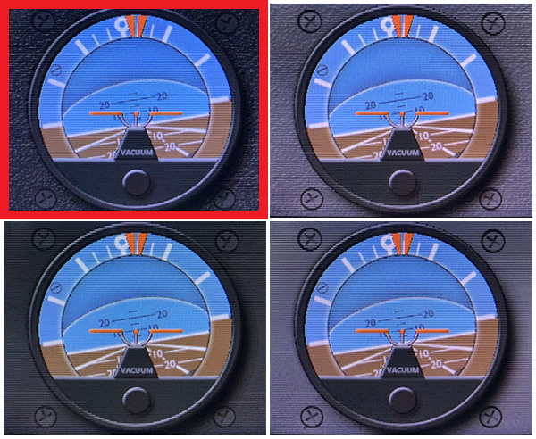
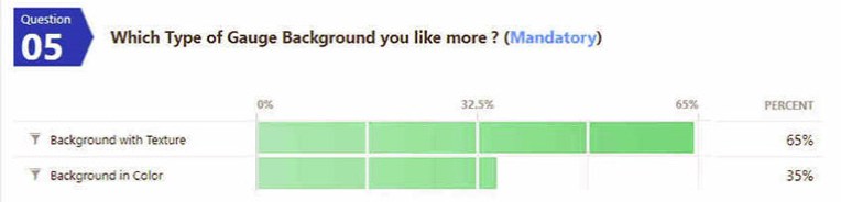
Regarding the background of my gauges, followings are the results from the “Gauge Background You Like More” survey posted on April 26.
====================
====================
====================
====================
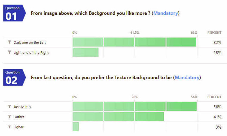
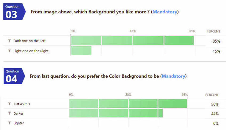
Obviously, the result shows that “Gauge Background with Texture in Dark Color” is the sure winner even though the number of respondents wasn’t much this time. Also, leaving it “Just as It Is” gains an upper hand, too.
In other words, most users are happy with what they are getting now — I am glad to find out that since I sometimes had doubts on choosing the texture background over the colored background.
There are useful opinions from respondents. One suggestion in particular worths noting is: the ultimate solution would of course be customizable pannel profiles, which can be linked to aircrafts and loaded accordingly — i.e. on some aircrafts a dark theme looks better, while on others some thing lighter feels more immersive etc.
It sounds reasonable and it is probably the direction when I am having a second thought about the new idea I had in mind recently about background implementation on my gauges.
Thank you to all who contributed.
